 | Some examples of photographic techniques
Click on any image to view the full size picture |
|
| Some examples of photographic techniques
Click on any image to view the full size picture |
|
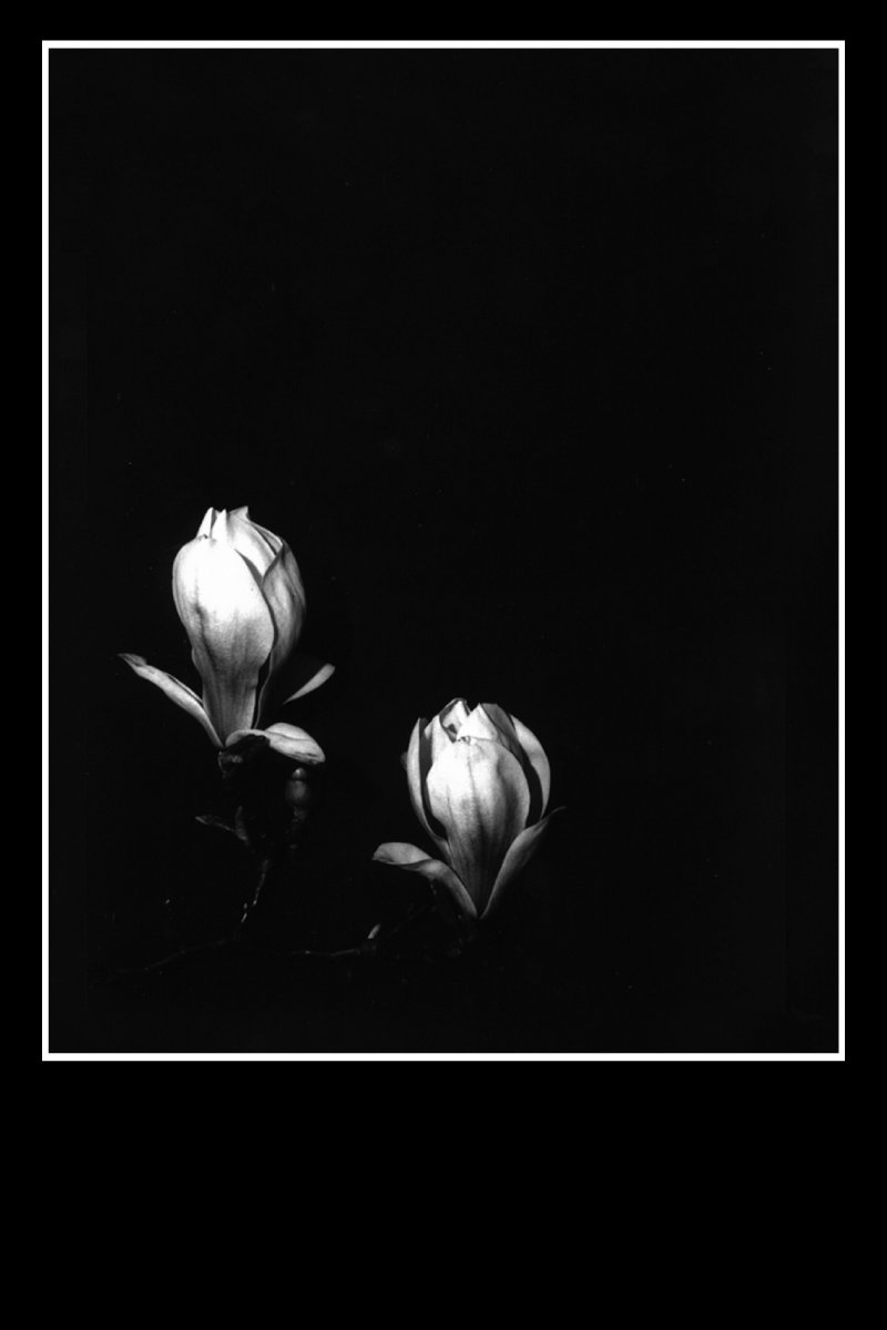
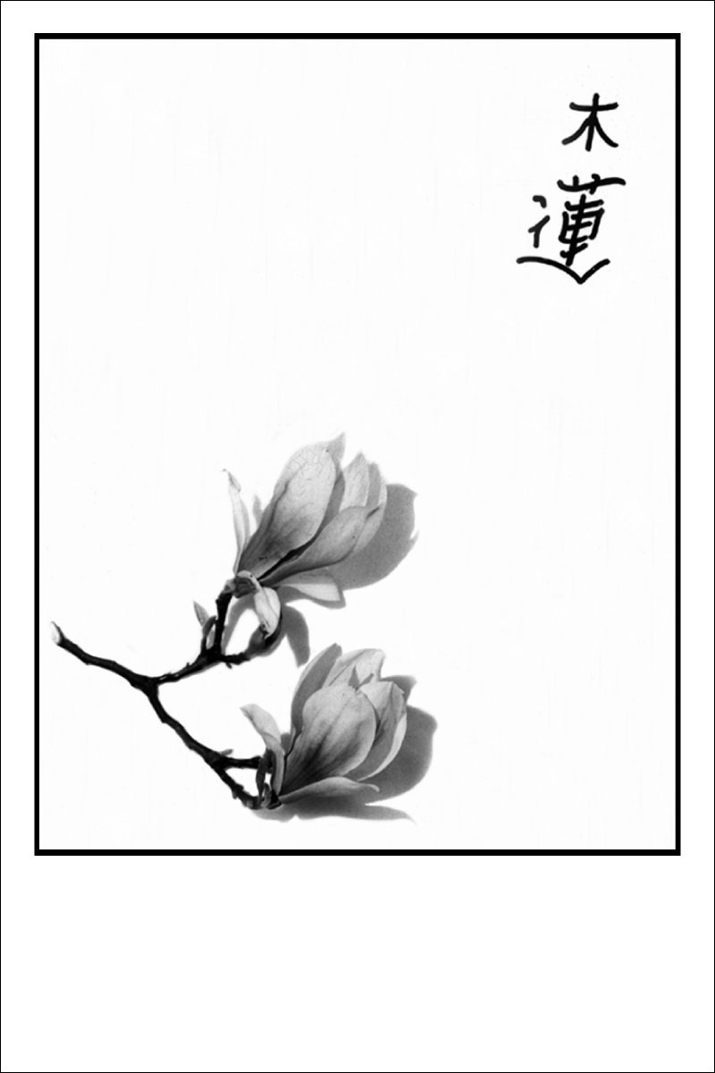
A feeble attempt to emulate Eastern Art form The art of China and Japan has long fascinated me and some years ago I tried to generate some photographs which encapsulated at least the spirit of the orient. |
||
|
The three images shown here are that attempt - they are shown exactly as I have them presented in photographic form ie. mounted as if for exhibition. | ||
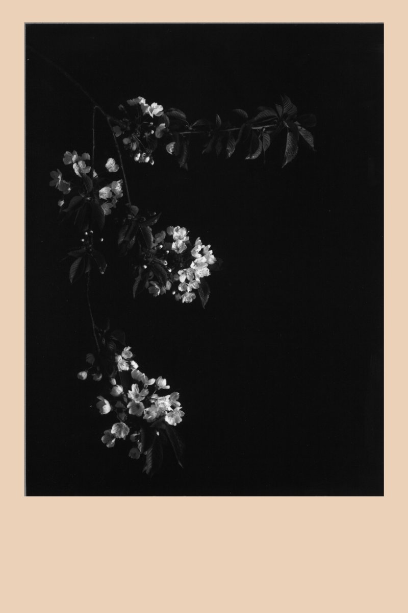 |
I don't believe I have come anywhere near my goal but I tried! | ||
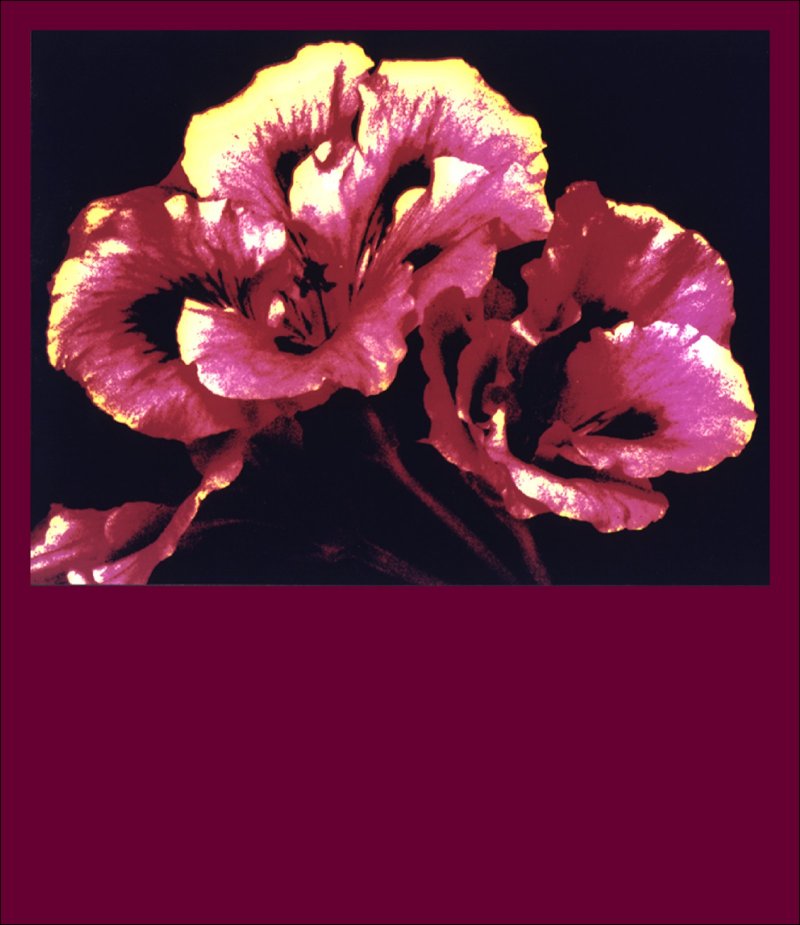 |
Posterization of images involves reducing the number of colours
to a minimum thus enabling easy production of 'posters'.
At least that was the original idea when technology meant
that large hoarding posters were produced by a labourous
screen printing process and 'Four-Colour' work(CMYK)was the
province only of high quality magazines produced using the
photogravure process, and costing an arm and a leg. Prior
to Adobe Photoshop et al. the process was very long winded,
involving production of separated litho positives and
subsequent negatives before the printing of the eventual
colour image could even be started.
This photograph was produced from a colour negative taken on a Linfof Technika camera using a '10 on 120' roll film back which gave a 6cm x 9cm image. The negative was used to produce four separate positive black and white quarter plate transparencies on Kodak Kodalith Film using colour filtering techniques and these were then used to produce contact negatives. This part of the process took some two days. Once the negatives were ready they were each placed in the enlarger in sequence and the colour photographic paper exposed four times taking care to register the paper and the light image between each exposure. Because of the difficulty of maintaining registration and testing different exposure levels this one photo took in excess of four days to produce - and even then could not be repeated at without going through the whole process again. Today I can achieve this result from a scanned photo in less than a minute, I can change the number of 'colours' at will and once the image is saved as a .TIF, I can print as many as I wish! | ||
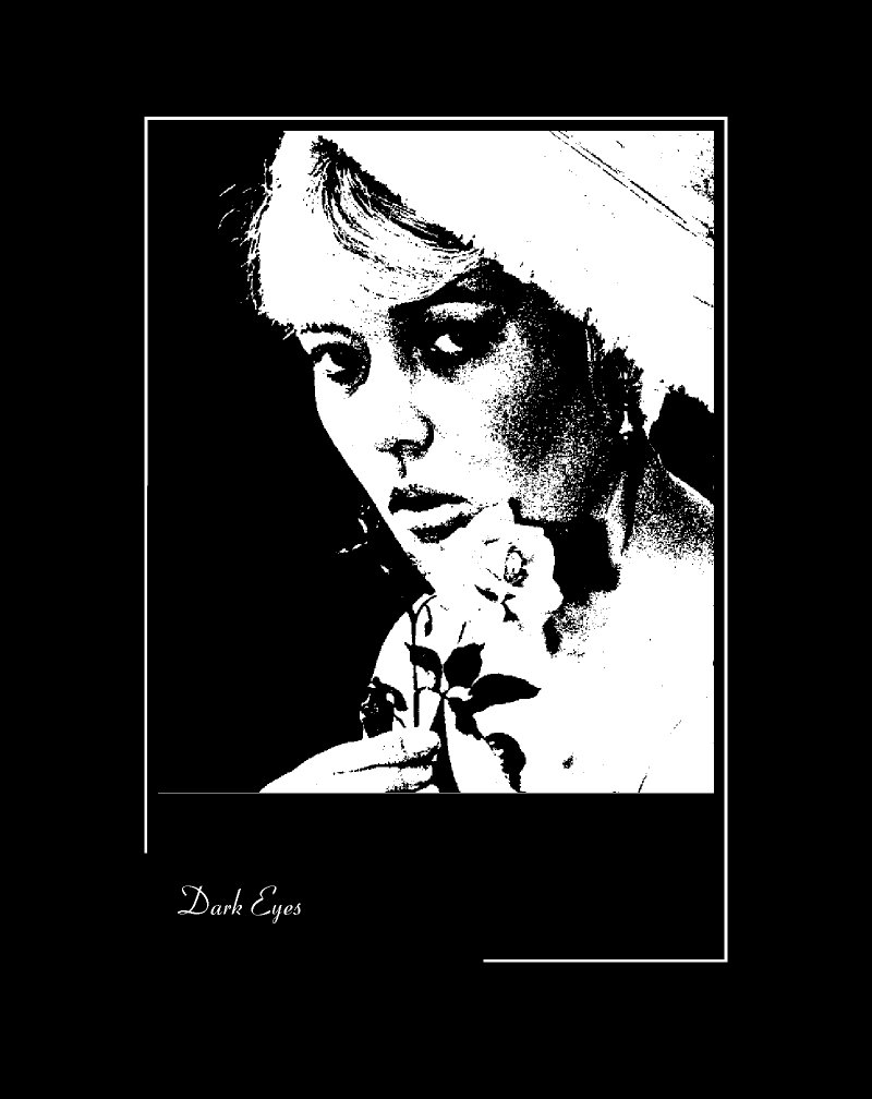 |
Impact!
Just as with the posterized photo of the Regal Pelargonium bloom, I used Kodalith film to produce this stark portrait. What I wanted to achieve as the final result was in my head before I put the film in the camera, and to that end I deliberately chose Kodak Royal X Pan film which was rated at 1600 ASA (so fast that 'grain' was inevitable). The exposures were increased by one and two stops and the development in Promicrol (an extremely fine grain developer) time increased by 50%. These 'adjustments' to the manufacturers recommendations all conspiring together to produce a very high contrast grainy negative. To get from the negative to the print needed further work of course. The neg was placed in the enlarger and a quarter plate Kodalith positive made - Kodalith is an extremely fine grain photomechanical film which is very slow (between 4 and 10 ASA)and therefore has a very distinct 'threshold' ie. the difference between the emulsion being affected by light and producing a black and not being affected is very small - so it produces stark black and white - this positive was then used to make a contact negative which could then be used to make the print! | ||
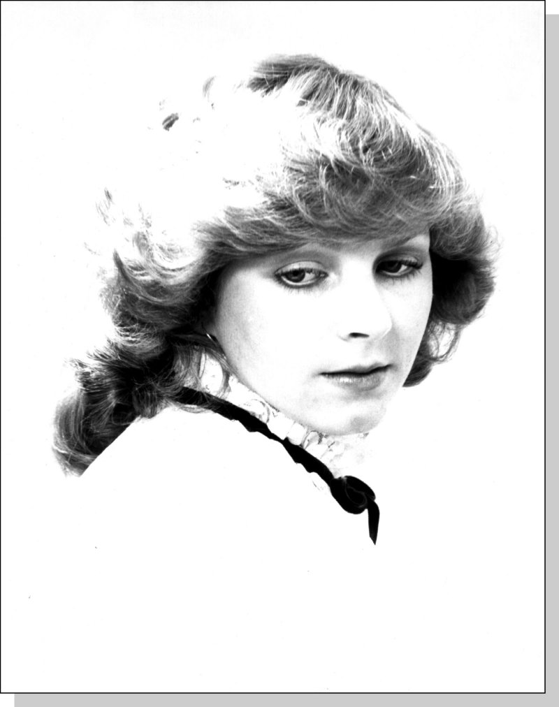 |
Hi - Key The concept of using minimal image information to provide a vehicle for viewer interpretation led me to experiment with Hi-Key work. This particular image is not a very good example but it is the best I achieved. In Hi-Key work there must be full tonal rendition, including solid black, but the overall effect should tend to the lighter tones. | ||
 |
This photo achieves these qualities only in the face itself but even if the image were cropped hard, as here, the Hi-Key effect does not work. The fact that the hair highlight has lost all tonal definition really means that the exposure and processing were incorrect and therefore the photo is not worthy of resurrection! | ||
| ... Return to home page |